What is Aesthic?
Answers.com defines aesthics as "An artistically beautiful or pleasing appearance" which I feel is a good start to the understanding of what aesthics means. I feel there are many componants within defining aethetics such as there should be quality within the look, it should be pleasing visually and the overall feel should be one that doesn't make you feel violenty ill! Aethics is ultimately all about the way something looks and whether or not the viewer finds it attractive or not.
Aestheically pleasing website...
I think the Splendour in the Grass website is one that is visually pleasing, especially for my age group. It uses bright fun colours on a black background but keeps the colours to a minimum of 3 - pink and green for text and red for the fruit. I think it is a lively website that makes you think feel like Splendour is going to be fun weekend outdoors but is not overpowering. It has rotating images of the headlining artists which looks good and is informing at the same time.
I think that Accept Jesus, Forever Forgive is quite possibly the worst website ever for aethtics, this site makes me feel violently ill just being there. The biggest piece of crap I have ever seen with constant flashing background in the colours of the rainbow. What were these people thinking? Apart from that it only has a cluster of links to other pages within the site etc. at the top of the page nothing at all what so ever describing the site or anything. This is a piece of rubbish!
What makes a good website is firstly the content contained within the pages followed by the way it looks, whether or not it is visually pleasing or makes you want to vomit! Also whether or not a site is easy to navigate around and that it is quick at downloading each page.
The difference between web aesthetics and print aesthetics is mainly the font style, as websites need fairly standard font so everyone can read it from all computers as well as it not looking retarded on the screen as it might if it was in cursive script and wouldn't be very easy to read. Where as print is hardcopy so it can have all kinds of fonts and be legiable. Also print can have more detailed images as it doesn't need to consider bandwidth!

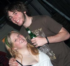
Me and Justin
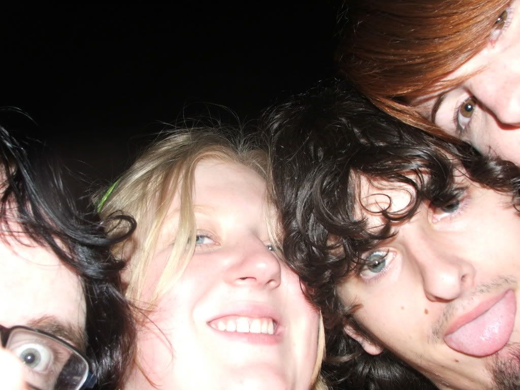
Learmonth Street House Warming
About Me
- Vivalin
- My names Viv and I come from a town in Victoria called Shepparton but now live in Wagga Wagga and am doing a double degree in Photography/Multimedia. I'm a bit of a dag, but I love to have fun so I don't particularly care, I'll do anything for a laugh and have a really bad habbit of speaking before thinking, it can get me into a lot of trouble at times 0_o
My Slide Show


1 comment:
well i would agree Splendour in the grass web page is awesome! but i think someone is going to hell...hate to knock jesus viv gosh lol. How was your dinner on Saturday, i cant believe i drop that water right infront of you, thats the first time i have ever dropped anything before how shamefull...dont look at me lol k well we have to book train tickets k xoxo matt
Post a Comment